De opdrachtgever, IT Executive Marcel Bos had al enige tijd een website, maar heeft nooit tijd gestoken in een professioneel logo-ontwerp. Van zijn opdrachtgevers krijgt hij als feedback dat hij in de regel snel tot de essentie (de “lowdown”) weet door te dringen, hoofdzaken van bijzaken onderscheidt en daarmee tastbare resultaten realiseert.
Lowdown Consulting
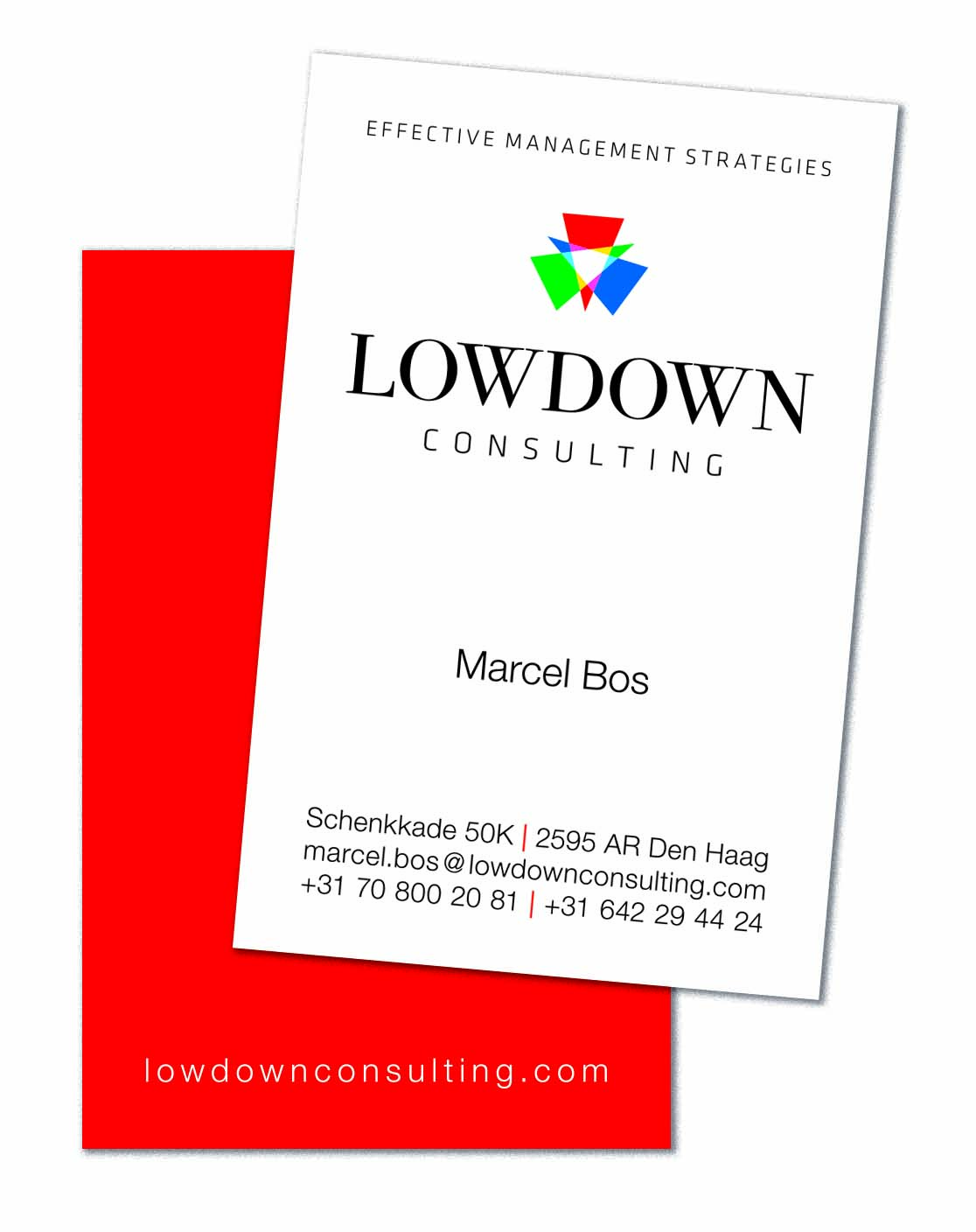
Dit logo symboliseert het “gekleurde” licht wat eenieder op een bepaald probleem laat schijnen. Lowdown Consulting haalt hier de essentie uit en creëert helderheid: de witte overlap. De achterkant van het visitekaartje is rood. Dit straalt energie uit, maar linkt ook naar een Oracle verleden en naar Team Resilience, waar hij, als een van de oprichters, de f Chairman vervult.
The client, IT Executive Marcel Bos has had a website for some time now. He has never put real effort in a professional logo-design. Regularly he receives feedback from his clients that he is able to quickly get to the essence of issues (“the lowdown”) focussing on the main topics and with that approach delivering great results.
These spotlights in the logo symbolize people’s “colored” opinions about a certain issue. Lowdown Consulting derives the essence from this and creates clarity: the white overlap. The back of the business card is red. This radiates energy, but also links to a history at Oracle and towardsTeam Resillience where, as one of the co-founders, he is the Chairman.